Why Your Booth Gets No Traffic (and How to Fix It)
You spent a fortune to be on the floor. Here's why attendees keep walking past — and how to make them stop.
You wrote the check, shipped the freight, and staffed the booth. Then you watched thousands of badges stream down the aisle — and right past you. It's the most frustrating moment in trade shows, and it almost never happens for the reason exhibitors think.
On a packed floor at CES or SEMA, you win or lose attention in about three seconds from across the aisle. That's not enough time to read your tagline or admire your product. It's only enough time to register height, motion, and light. If your booth fails that test, nothing else you do matters. Here's how to diagnose what's actually going wrong — and fix it.
- You win attention in about 3 seconds from across the aisle — height, motion, and light do the heavy lifting.
- LED video walls, lightboxes, and posters out-pull static printed graphics because they move and glow.
- One clear, six-word message beats five competing ones; open walk-in layouts beat fortress booths.
- Attention slows people down — but an interactive demo or real reason to stop is what converts traffic to leads.
- Fix problems in order: sightline and motion first, then message and layout, then your hook.
Diagnosis 1: Nobody Can See You From Across the Aisle
The single most common problem is sightline. Attendees walk down the center of wide aisles scanning for something that breaks the visual plane. If your tallest element is an 8-foot pop-up at booth-floor level, you disappear behind the crowd and the neighbor's hanging sign.
The fix: Build up. Use the maximum hanging-sign and back-wall height your space allows — confirm the limits in your show's exhibitor manual, since they vary by hall and booth size. A tall, bright element that reads from 40+ feet away is the difference between being on the map and being invisible.
- Put your brand and one benefit at eye level and above the crowd.
- Avoid burying signage behind product, counters, or staff.
- Test it: stand 30 feet away in the aisle. Can you tell what you do in two seconds?
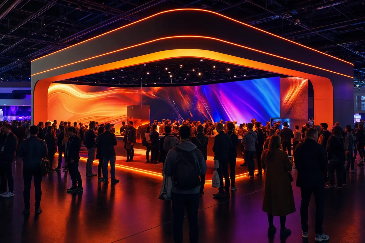
Diagnosis 2: Your Booth Doesn't Move or Glow
The human eye is wired to lock onto motion and light. A static printed banner — no matter how beautiful the design — is competing against neighbors who are literally moving and glowing. You will lose that fight every time.
This is why LED video walls consistently out-pull printed graphics. A wall running a 15-second loop of your product in action creates motion that catches peripheral vision from down the aisle. Where a full wall isn't in budget, bright, edge-lit SEG lightboxes or eye-level LED posters add the glow and movement that flat vinyl can't.
The fix: Add one source of motion and one source of brightness. Even a single LED poster at the corner of an inline booth dramatically increases stop rate compared to a fully static front.
Diagnosis 3: You're Saying Five Things Instead of One
Walk your own floor and you'll see it everywhere — back walls crammed with three logos, a tagline, four product names, a QR code, and a paragraph of body copy. From the aisle, it reads as noise. The attendee's brain can't parse it in three seconds, so it moves on.
The fix: Pick one message. Not your favorite message — the one that makes a stranger think "that's relevant to me." Lead with the outcome you deliver, not your company name. Your name belongs on the booth, but it shouldn't be the biggest words.
- One headline, six words or fewer, legible from across the aisle.
- Move features and details to eye-level panels and your reps' conversations.
- If you can't summarize why someone should stop in one sentence, your booth can't either.
Diagnosis 4: You Built a Fortress, Not a Doorway
Counters across the front, tables forming a wall, staff standing shoulder-to-shoulder behind a barrier — these all signal "keep out." Attendees read closed layouts as a commitment they're not ready to make, so they avoid eye contact and keep walking.
The fix: Open it up. Pull demos and product toward the aisle. Create an obvious entry point — a clear path that invites someone to step in without feeling trapped. Walk-in, open layouts consistently outperform fortress booths because they lower the social cost of stopping.
- Angle elements to funnel foot traffic inward.
- Keep at least one corner or side fully open to the aisle.
- Position staff to greet, not guard — out front, not behind a counter.
Diagnosis 5: There's No Reason to Stop
Say your booth nails height, motion, and a clear message — and people still don't linger. Now the problem is the hook. Attention gets them to slow down; a reason gets them to stop. Without one, they admire your wall for two seconds and keep moving.
The fix: Give them something to do or see. An interactive product demo, a live screen showing real results, a short looping case-study video on your LED wall, or a hands-on station all convert passive traffic into actual conversations. At a lead-driven show like MJBizCon, the booths with a genuine reason to stop fill their pipeline; the ones relying on logo recognition don't.
The best hooks are specific and fast — something an attendee can engage with in under a minute and walk away understanding what you do.
Putting It Together: The 3-Second Test
Before the show, run every design decision through one filter: does this help a stranger 30 feet away understand and care in three seconds?
- Height: Can they see you over the crowd?
- Motion + light: Does something glow or move to catch the eye?
- Message: One clear idea, not five?
- Layout: Does the booth invite them in or wall them out?
- Hook: Once they're slowing down, is there a reason to actually stop?
Fix these in order. Sightline and motion come first because they earn the glance. Message and layout earn the approach. The hook earns the lead. Skip the early steps and the later ones never get a chance.
Frequently asked
How big does an LED video wall need to be to make a difference?
It depends on your booth size and viewing distance, but even a modest wall on the back of a 10x20 outperforms static graphics because it adds motion and brightness. For inline booths, a single LED poster or lightbox can deliver much of the effect at lower cost. We can spec the right size in a custom design.
My budget is tight — what's the highest-impact fix?
Add one source of motion or light and cut your message down to one idea. An LED poster at the aisle edge plus a ruthlessly simplified headline costs far less than a full rebuild and addresses the two biggest reasons booths get walked past.
Are there height limits on what I can build?
Yes, and they vary by show, hall, and booth size — including separate rules for hanging signs versus back walls. Always confirm the exact limits in your show's official exhibitor manual before finalizing your design.
Will an open layout make my booth feel less secure for product?
Open doesn't mean unprotected. You can keep high-value items in a lockable cabinet or a staffed demo station while still leaving a clear, inviting entry path. The goal is removing barriers to entry, not removing all structure.
Do I really need an interactive demo, or is a good video enough?
A looping video on a bright wall is enough to slow people down and works well for many exhibitors. But a hands-on demo or live screen converts more of that slowed traffic into real conversations. Match the hook to your product and your goals for the show.
Keep going
Planning a Las Vegas booth?
Tell us your show — a free quote, usually same day.